Portfolio
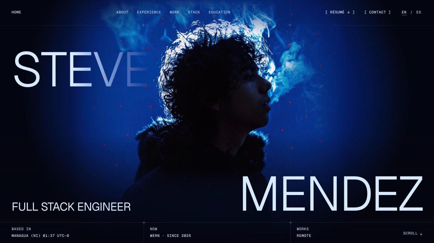
The visual side of this portfolio is inspired by Bocanada, Gustavo Cerati's 1999 album: its tones, its red rhombuses and dots. This page explains that inspiration, the rules that came out of it, and the technologies the site is built with and why.
Bocanada
Bocanada is the record Gustavo Cerati released in 1999, the first one after Soda Stereo. It is my favourite of his: he had just left a huge band and the album he made is slower, stranger and more his own than anything from before. That seemed like the right reference for a site one person builds alone.
The site does not reproduce the record. It takes a palette and a few marks from it, and the home page alludes to the cover.
- The tones. Cobalt blue, smoke and ink from the cover; the paper of the booklet for the light sections.
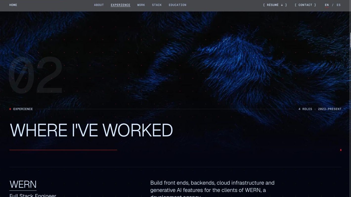
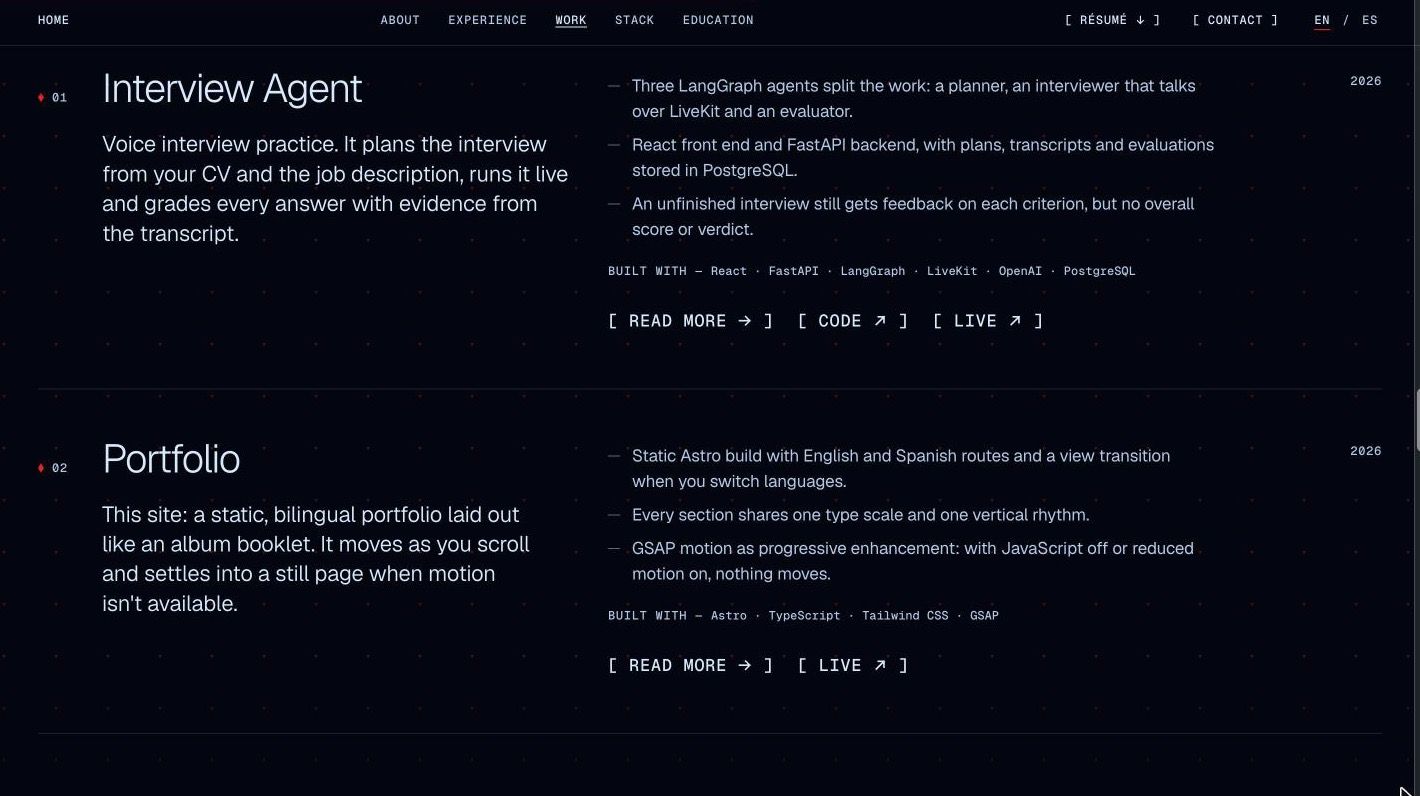
- The red dots. The inner sleeve is blue fur with red dots. They sit behind the Experience section and drift very slowly behind the Work list.
- The red rhombus and the thin red line. The only two accents the site allows itself: the rhombus marks the index and the current item, the line marks reading.
- The home page is an allusion to the cover: the name split around a portrait that melts into blue and smoke.
The rules
A reference is only useful if it turns into rules you can check. These are the site's.
- Two tones. Ink and paper, like a sleeve and a booklet. Every component reads correctly on both, because the role colours flip with the background.
- Red is a mark, never text. The red line means reading or section: the rule under each title, the progress hairline at the top, the active language. The red rhombus means index or here and now: the kicker, the track numbers, the current job. Everything structural is grey.
- One type scale. Six sections with six different layouts, but the title of a job, a project and a credential are the same size, and a row, a card and a group breathe the same.
- Nothing moves forever. The only perpetual motion is the drift of the dots; everything else happens once, as it enters, and stands still afterwards.
What it's made of, and why
The stack is small on purpose. Each tool is here because it removed something rather than added it.
- The site is static HTML with no JavaScript by default, so it loads before any script runs and reads without one. Astro also gives it the English and Spanish routes, self-hosted fonts with metric-matched fallbacks, responsive AVIF and WebP images from one source file, and the view transition when you switch languages.
- The design tokens live in CSS, in one theme block: colours sampled from the cover, a fluid type scale and three levels of vertical rhythm. Every role on the scale has a utility, so a component names its role instead of its numbers.
- ScrollTrigger and SplitText build each section in as it enters and draw the hairlines on scroll. It is a layer on top: with JavaScript off or reduced motion on, the page shows its final state and nothing moves.
- Strict everywhere. The content is typed data, one file per section, with both languages side by side so a string can never go missing in one of them.
- One light grotesk for everything that is read and one mono weight for the micro-labels, both served from this domain.
- Dependencies wait seven days after publication before they can be installed and never downgrade, and every commit is linted, formatted and checked against Conventional Commits before it lands.
- Three mobile runs against the built site, and the build fails under 90 in performance and best practices or under 95 in accessibility and SEO.
- The blue fur and the ribbon of smoke are images generated with the record's sleeve as a reference, then compressed to a few kilobytes each. The portrait on the home page is me, set in the cover's field.